Key Metrics Introduction:
This week in my digital marketing class, we looked at how our websites are doing. Through using Google Analytics (GA4), I was able to measure things such as user acquisition, page views, and demographic details. These aspects are important because user acquisition shows how many new users are viewing your website, page views show which post/blogs are getting the most attention, and demographic details show you where the viewers are coming from to see if you reached the audience you were hoping to reach. Throughout this assignment, I used the help of Chat GPT to help explain what each of these aspects meant, and Google Analytics GA4 to measure these aspects from my website.
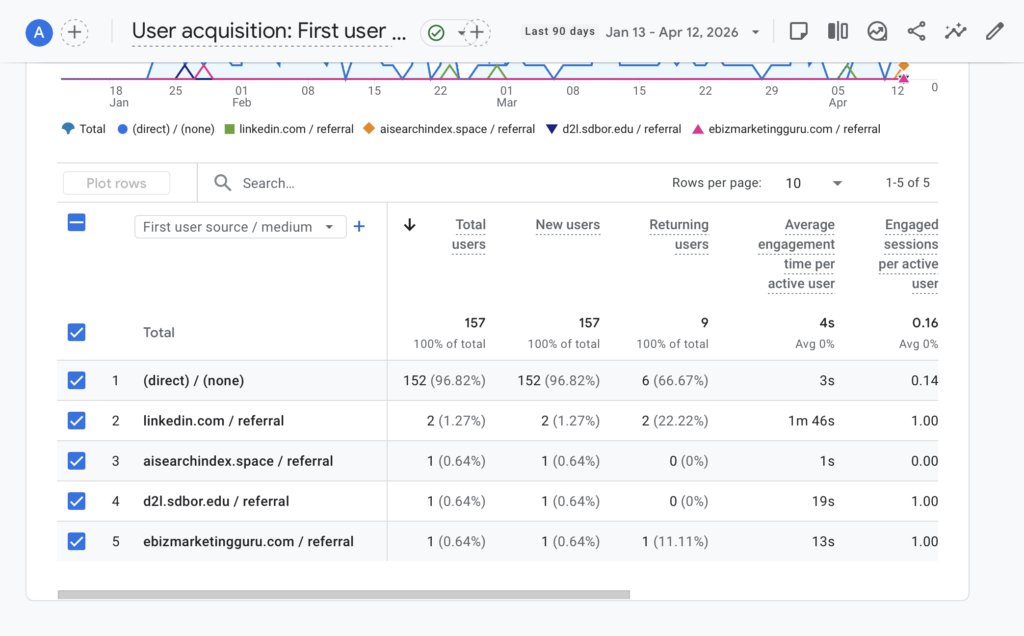
User acquisition – First user source / medium:
I used “First user source/medium” because it shows where new users are coming from. When gaining information about user acquisition, I looked at new users, average engagement time, and engaged session per active users. These aspects show the new users coming to the website, the percentage of sessions that were engaged, and the average amount of time a user spends on the website.
Below is a picture of the GA4 analytics containing the user acquisitions based on the three metrics spoken about previously.
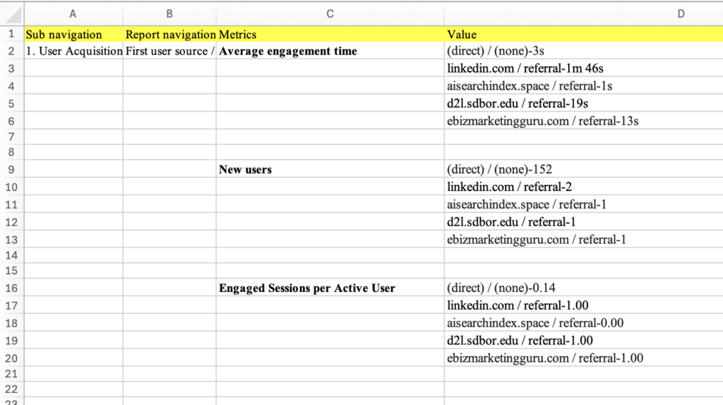
I took this information and transported it to an Excel sheet to make it more organized before giving the information to Chat GPT to analyze it.
Below is a picture containing the excel sheet with the given information.
Now that the information has been organized, I took this information to Chat GPT, and asked it this prompted: “When I sorted the average engagement time in descending order in the First user source/medium classification, the following result came out. Please explain”
Chat GPT gave this response:
“What you’re looking at is “First user source/medium” vs Average engagement time, sorted in descending order—but the pattern suggests a mix of real traffic, low-quality traffic, and possible spam or tracking noise.”
Information Chat GPT gave back:
-Explained what first user source/medium was.
-Interpreted what each time meant.
-Gave recommendations on how to improve these metrics.
Next, I asked Chat GPT to interpret the new users, and asked it this prompt:
“When I sorted the new users in descending order in the First user source/medium classication, the following result came out. Please explain.”
Chat GPT gave this response:
“This result is showing your First user source/medium (GA4 acquisition dimension) sorted by new users in descending order, meaning it tells you where users first came from when they originally discovered your site.”
Information Chat GPT gave back:
-Break down each of the users and their numbers.
-Gave an overall insight describing consistency, and which one had highest/lowest numbers.
-Provided a key takeaway.
Next, I asked Chat GPT to interpret the engaged sessions per active user, and asked it this prompt:
“When I sorted the engaged sessions per active user in descending order in the First user source/medium classication, the following result came out. Please explain. “
Chat GPT gave this response:
“This metric is showing Engaged sessions per active user by First user source/medium, sorted in descending order. It tells you how engaged users from each acquisition source are, on average.”
Information Chat GPT gave back:
-Explained what the metric means.
-Interpreted the results.
-Explained each type of insight.
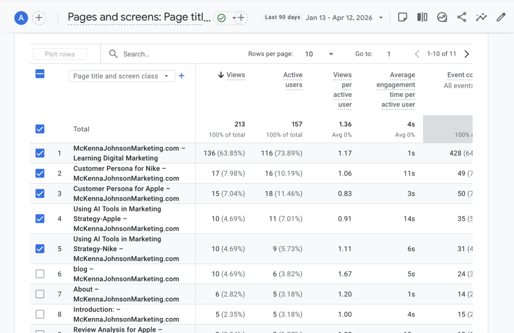
Engagement – Page title and screens
Next I looked at engagements, specifically page titles and screens. This tells us which blogs or pages are getting the most attention. Similarly to the user acquisition, we looked at three different metrics; average engagement times, views, and new users. Average engagement times tells us how long users are spending/engaging on a page, views tell us how much of the content is getting viewed by the users, and new users tells us how many new users are viewing the content.
Below is a picture of the GA4 analytics containing the engagements based on the three metrics spoken about previously.
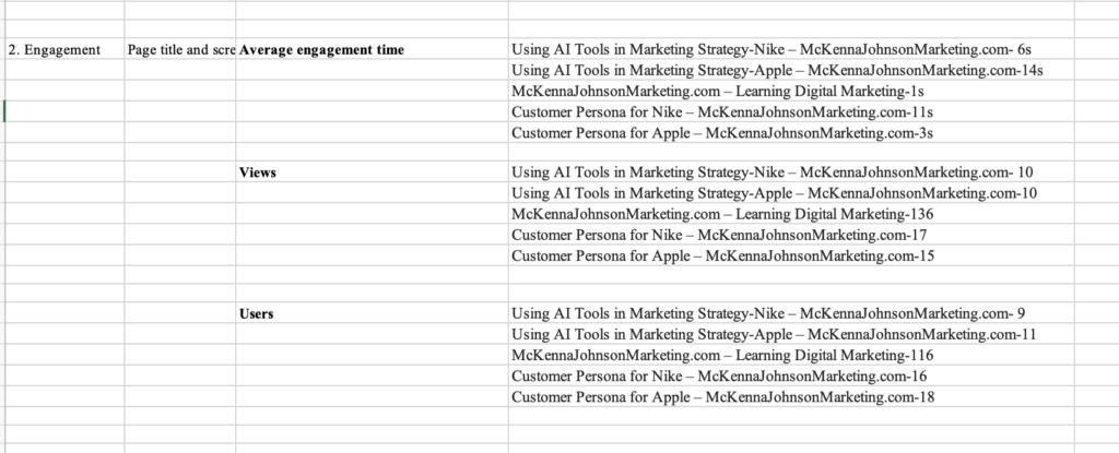
I took this information and transported it to the Excel sheet to make it more organized before giving the information to Chat GPT to analyze it.
Below is a picture containing the excel sheet with the given information.
Now that the information has been organized, I took this information to Chat GPT, and asked it this prompted: “When I sorted the average engagement time in descending order in the Page title and screen class classification, the following result came out. Please explain.”
Chat GPT gave this response:
“This result is showing Average engagement time per active user by Page title and screen class, sorted from highest to lowest. In GA4, this metric tells you:
How long users actively stayed engaged on each specific page (not just time on site, but actual interaction time)”
Information Chat GPT gave back:
-What the results mean.
-Overall patterns.
-Key insights.
Next I asked Chat GPT to interpret the views on the website, and asked this prompt:
“When I sorted the views in descending order in the Page title and screen class classifiication, the following result came out. Please explain.”
Chat GPT gave this response:
“This report shows Views by Page title and screen class, sorted in descending order. In GA4, views = total times each page was loaded or visited, including repeat visits by the same user.
So unlike engagement time (which shows quality), this metric shows popularity/traffic volume.”
Information Chat GPT gave back:
-What the results mean.
-Overall patterns.
-Key insights.
Next I asked Chat GPT to analyze new users that visit the website, and asked this prompt:
“When I sorted the users in descending order in the Page title and screen class classication, the following result came out. Please explain.”
Chat GPT gave this response:
“This report shows Users by Page title and screen class, sorted in descending order. In GA4, users = the number of distinct individuals who visited each page at least once during the selected time period.
So unlike views (traffic volume), this metric tells you reach—how many unique people saw each page.”
Information Chat GPT gave back:
-What the results mean.
-Overall patterns.
-Mid-tier and lower reach.
User attribute – Demographic details
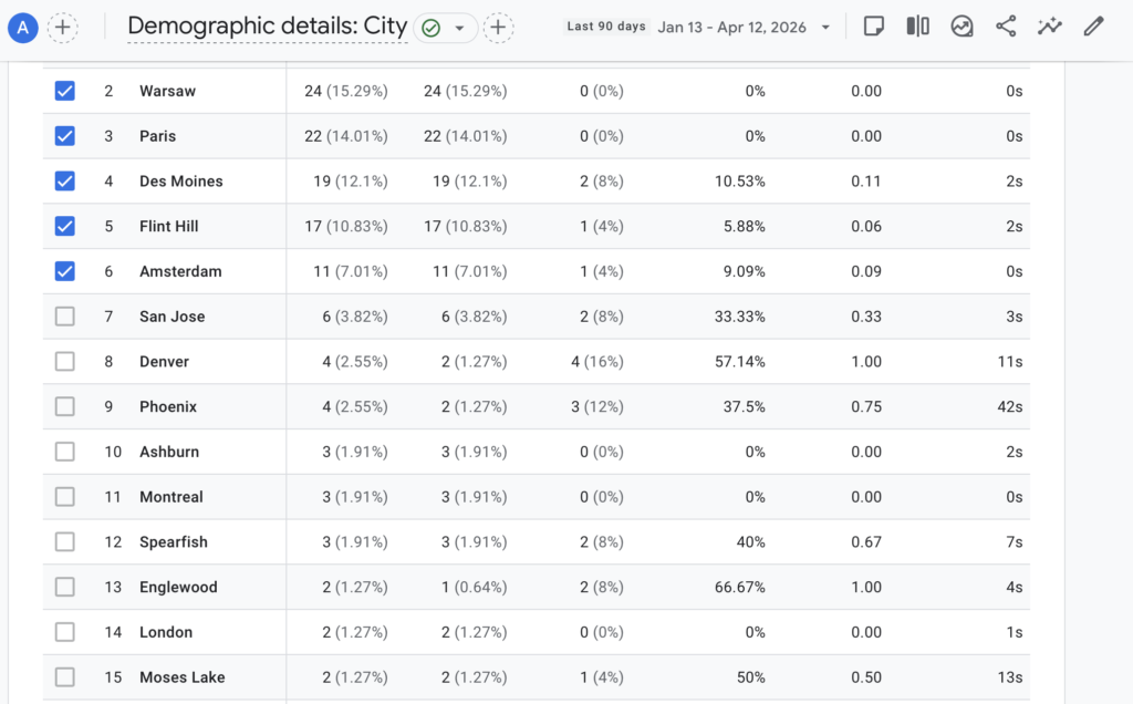
Next I looked at demographic details, specifically Country and City. I looked at these two specifically to see if the website is reaching the correct target audience. For this section, I looked at for different metrics which include active users, engagement rate, average engagement time per active user, and engaged session per active user. Active users show how many users visit from a location, Engagement rate shows how many users are engaged with the content from a location, Average engagement time per active user shows how much engagement the user is giving on the site from a location, and engaged session per active user shows how often users that are engaged from a location come back to the website.
Below is a picture of the GA4 analytics containing the Demographic details based on the three metrics spoken about previously.
I took this information and transported it to the Excel sheet to make it more organized before giving the information to Chat GPT to analyze it.
Below is a picture containing the excel sheet with the given information.
Now that the information has been organized, I took this information to Chat GPT, and asked it this prompted:
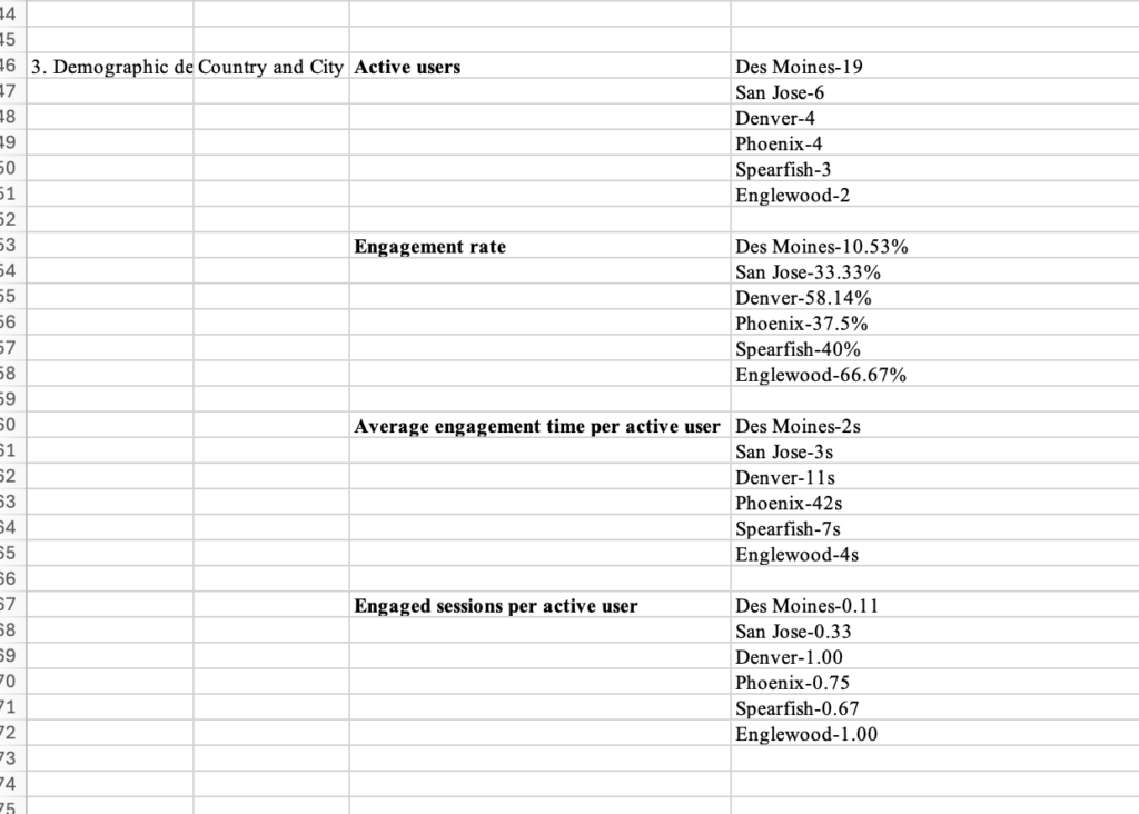
“Let’s begin the analysis assuming my cities of interest are Des Moines, San Jose, Denver, Phoenix, Spearfish, and Englewood.
When I sorted Active users in descending order in the Country and city classification, the following result came out. Please explain
When I sorted Engagement rate in descending order in the Country and city classification, the following result came out. Please explain
When I sorted Average engagement time per active user in descending order in the Country and city classification, the following result came out.
Please explain When I sorted Engaged sessions per active user in descending order in the Country and city classification, the following result came out. Please explain.
Finally, please provide a conclusion based on the answers to these four questions.
Active users Des Moines-19 San Jose-6 Denver-4 Phoenix-4 Spearfish-3 Englewood-2
Engagement rate Des Moines-10.53% San Jose-33.33% Denver-58.14% Phoenix-37.5% Spearfish-40% Englewood-66.67%
Average engagement time per active user Des Moines-2s San Jose-3s Denver-11s Phoenix-42s Spearfish-7s Englewood-4s
Engaged sessions per active user Des Moines-0.11 San Jose-0.33 Denver-1.00 Phoenix-0.75 Spearfish-0.67 Englewood-1.00″
Chat GPT gave this response:
“Great—this is a classic GA4 “city quality vs volume” situation. I’ll walk through each metric separately and then synthesize everything into a clear conclusion.”
Information Chat GPT gave back
-Active users broken down with results (Des Moines is my primary traffic driver).
-Engagement rate broken down with results (Denver and Englewood users are highly engaged).
-Average engagement time per active user broken down with results (Phoenix users spend the most time actively engaged).
-Engaged session per active user broken down with results (Denver and Englewood users are most key to return to the website.
Conclusion
I thought it was really interesting to see all the different types of analytics for my website. There were many things that were shocking to me like the demographic details. I never would have expected Poland to be one of my more engaged locations. I really enjoyed learning about this topic as I find it really interesting learning about what different things are more popular, and get more attention. Overall I enjoyed learning about this topic.